Zones
Live Zone Chart
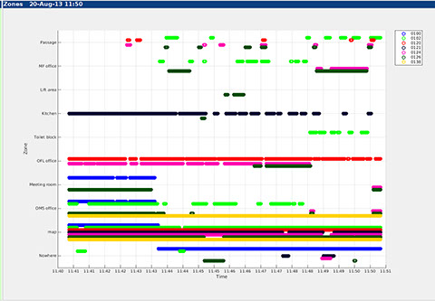
Displaying zones is an alternative way of showing device positions. Instead of plotting an icon on a map, the zones chart presents a time history plot of the zones in which devices on the chosen list were located.
Along the X axis is time for the recent history of device positions. The scale of the X axis varies depending on the position update interval but is typically 10 minutes duration.
The Y axis is divided into the available zones, each being shown as a "swimming lane" across the chart. The zone name and grid line is positioned in the centre of this lane.
The bottom zone is a special one called "nowhere" which is used to show devices that are off-network and not being logged.
Each of the devices in the selected Set is assigned a different colour. On the right of the chart is a legend showing the plot colour matched to the Name of the device. In the example on the right the name is the same as the ID.
The trace for each device is slightly offset within the zone lanes, so that device traces do not cover and obscure one another. When zones are enclosed within other zones, or overlap, it is possible for the device to be present in 2 or more zones at the same time.
At each point in time the device is drawn as a set of connected points in the zone in which it is located. So in the chart on the right we can see that device 0126 (olive/dark green) was moving around between the various offices whereas 0120 (red) was essentially in the OFL office for the entire duration.
Zone chart options
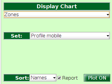
At present the only chart configuration available is to choose the set of devices to show on the chart. The example on the right is generated for devices on the "mobile" profile. Note that this list also includes devices allocated to profiles that are based on the mobile profile. See the profiles documentation for details.


knowhere anywhere
3rd Floor, St Andrew's House, 59 St Andrew's Street, Cambridge, CB2 3BZ, UK
tel: +44 1223 651390, email: info@omnisense.co.uk
Copyright © 2016, Omnisense Ltd