RSSI Chart
Signal Strength Chart
The title bar of the Signal Strength (RSSI) chart contains its name and the current plot time.
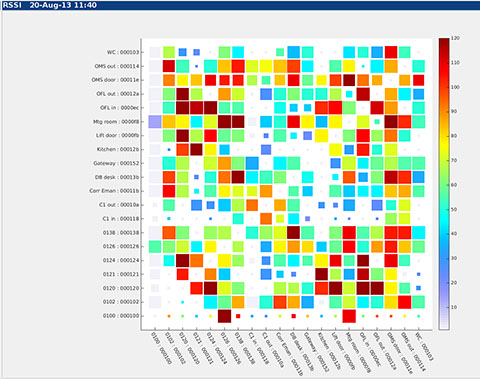
The chart itself is a matrix with each square at the intersection of a row and column representing the strength and quality of the radio signal connecting the two devices.
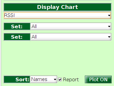
Under the display options settings there are two chart-specific controls both labelled "Set". The top one is the list of devices to use for the rows of the chart, and the bottom one is the list of devices to use for the columns. In the example on the right the chart shows the default plot of "All" devices against "All". Depending on the operating modes of the nodes in the system it is often more meaningful to use different lists. In very big networks the lists may be split into parts so that they can be shown in the available chart space.
"Sort" defines the order in which the devices are drawn on the axes.
The "Reports" box is ticked indicating that only reportable nodes will be shown. When it is not ticked all nodes are included in the lists.
Chart Interpretation
The colour of each square at the intersection of a row and column represents the signal strength.
On the right of the chart is a colour bar showing the mapping between signal strength and colour. The values assigned are relative within the range 0 to 120, where 0 is the weakest signal usable by the radio and 120 is the strongest signal reported by it.
The diagonal squares in the chart are used to indicate the weakest signal received by the device since the last report: this can be useful as an aid to identifying radio interference. The mapping All against All results in a regular square plot. When different lists are used for rows and columns it is unlikely that these self mappings lie on the diagonal.
The size of the coloured square represents the average packet loss in the radio link connecting the two devices. Full-sized squares which touch their neighbours indicate virtually no packet loss on the link. The smaller the filled square the higher the packet loss.
Empty squares between different nodes (e.g. top left in the example) indicate that communications between these two devices is not possible, or that they are not configured to communicate with one another.
S500 specific Interpretation
The series 500 system uses ToA (time of arrival) measurements between nodes to position them. Each node broadcasts to all others within range, and each node may measure all, some or none of its neighbours' broadcasts depending on the configured operating mode.
Nodes transmit across the rows, and receive down the columns. Therefore filled squares in a row indicate which neighbours measured and reported the row node's broadcast, and filled squares in a column indicate which neighbours the column node received, measured and reported.
Systems based on ToF (time of flight) are symmetrical, and others may be different.


knowhere anywhere
3rd Floor, St Andrew's House, 59 St Andrew's Street, Cambridge, CB2 3BZ, UK
tel: +44 1223 651390, email: info@omnisense.co.uk
Copyright © 2016, Omnisense Ltd